

Saltbox
Saltbox is a Smart Home Security System that combines ease-of-use with the security and smart home integrations users most want.
The Problem
Users need a home security system that combines the smart home integrations they want and expect and a functional alarm and recording system with alerts, but they find these systems complicated to set up and use. Complex programming is a frustration for many users.
The Solution
Saltbox has a simple set up, easy to navigate and use features, and all the smart home integrations users need.
Tools used


I conducted user interviews and surveys to get a sense of user needs, behaviors, and frustrations regarding Home Security Systems.
Survey results revealed users’ desire for recording playback to include motion and sound detection. Users also want to control and access everything via smart phones. They would like more automation and integrations. Many users are frustrated with complicated programming and faulty devices.

User interviews led to some interesting concepts regarding new features. Users often wish they could view their home from above. Leveraging Birdseye Satellite systems, Saltbox can include a birdseye perspective, thereby allowing users to gather a more complete view of their homes.
Cameras that function well, record well, and store the data remain a priority. Some users do not incorporate alarm systems, rather rely solely on cameras.
Users also discussed problems with not being able to adjust detection sensitivity.


Based on feedback from the user surveys and user interviews, I created a user persona. The primary goals are to create a home security system that allows for multiple camera setup, integrates smart home devices, is easy to setup and navigate, and includes high-quality recording.
Competitive Analysis

Competitive analysis and inspiration. Dashboards can be complicated. I spent considerable time researching various dashboards, discovering designs that provide a clear and positive user experience. What is the best journey, how much content do you put on one screen? Too much information can be overwhelming for the average user.
Site Map and User Flows

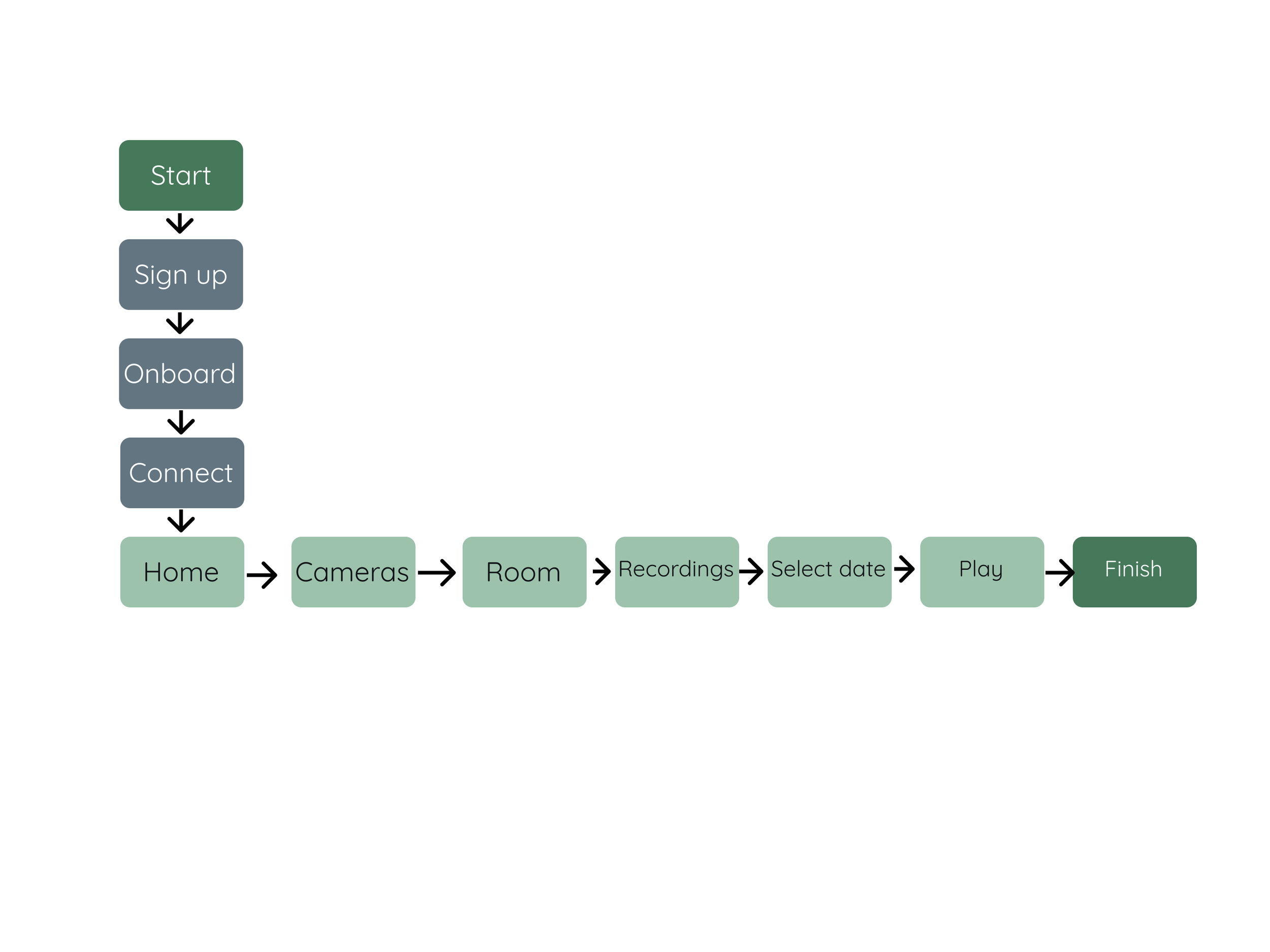
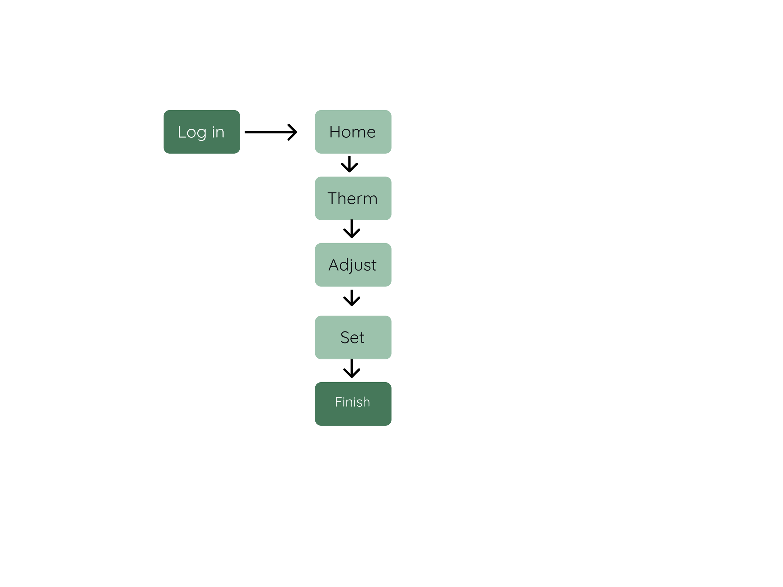

After creating the site maps and user flows, I began sketching low-fidelity wireframes. My goal was to be inclusive while not over-complicated the UX or UI. Users expressed frustration with difficult programming and navigation.
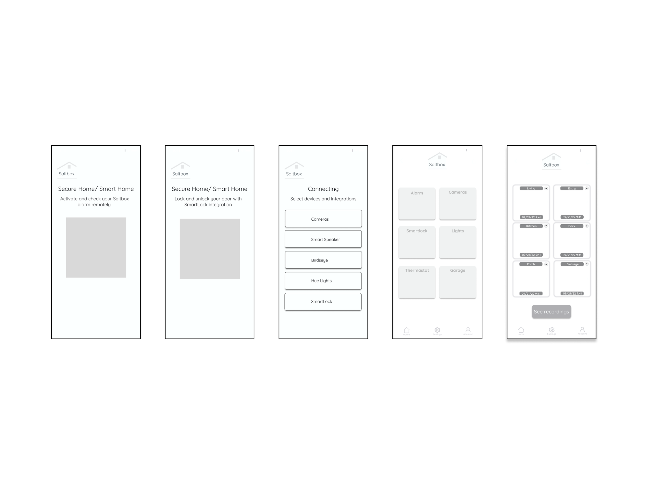
Mid-fidelity
Before adding color or high-fidelity components, I used the mid-fi screens to begin determining how the features would be laid out. The biggest challenge at this stage was deciding how the programming and settings would work, and in what order. I experimented with several possible solutions for setup and ended with minimal content per screen as a way to keep the look and feel minimal. The reasoning is to not overwhelm the user. Do one step at a time.

Style Guide
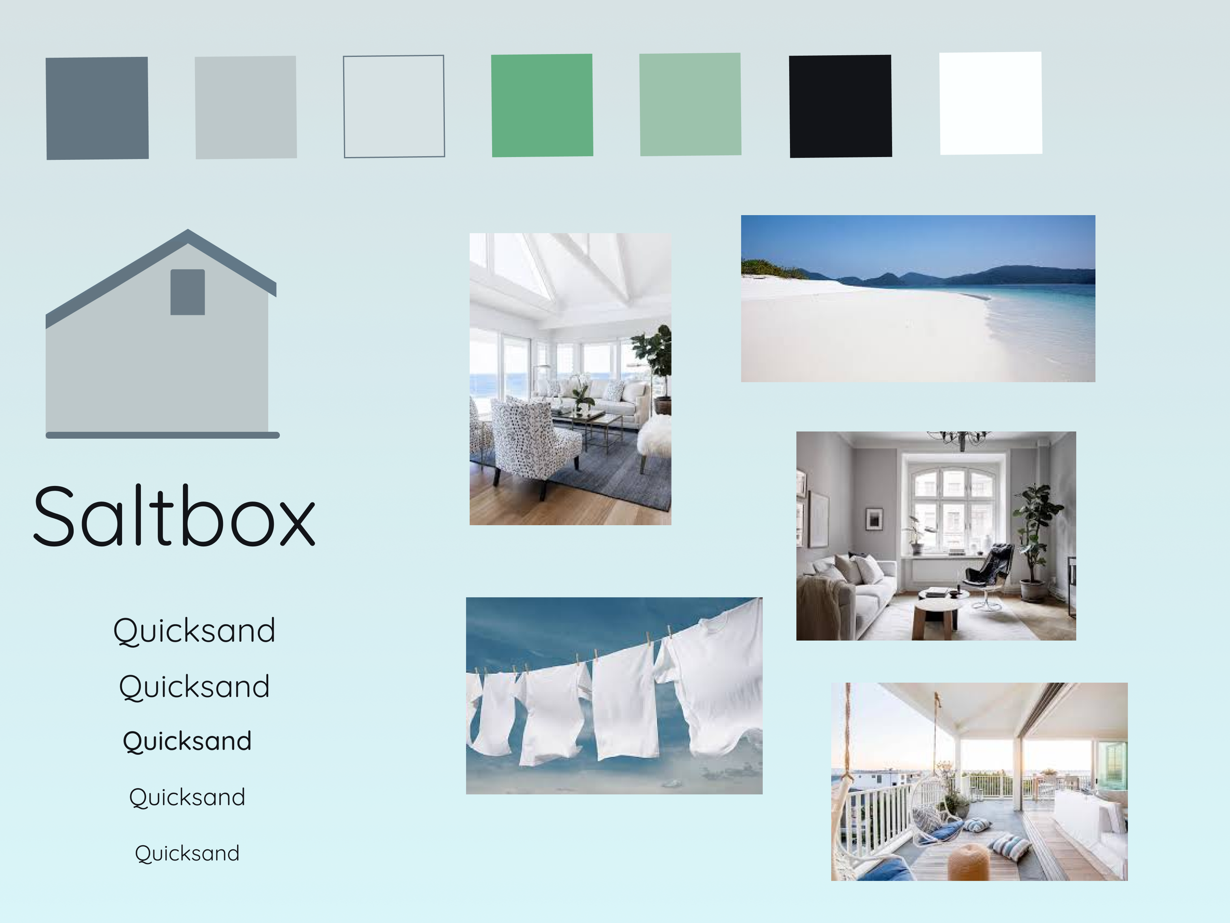
Mood boards are a favorite of mine. It is a great space to brainstorm the look and feel, consideration color psychology and messaging. For Saltbox, I chose to include muted blues and greens, to establish a sense of calm and trust. I also wove in linen colors to create a clean look.

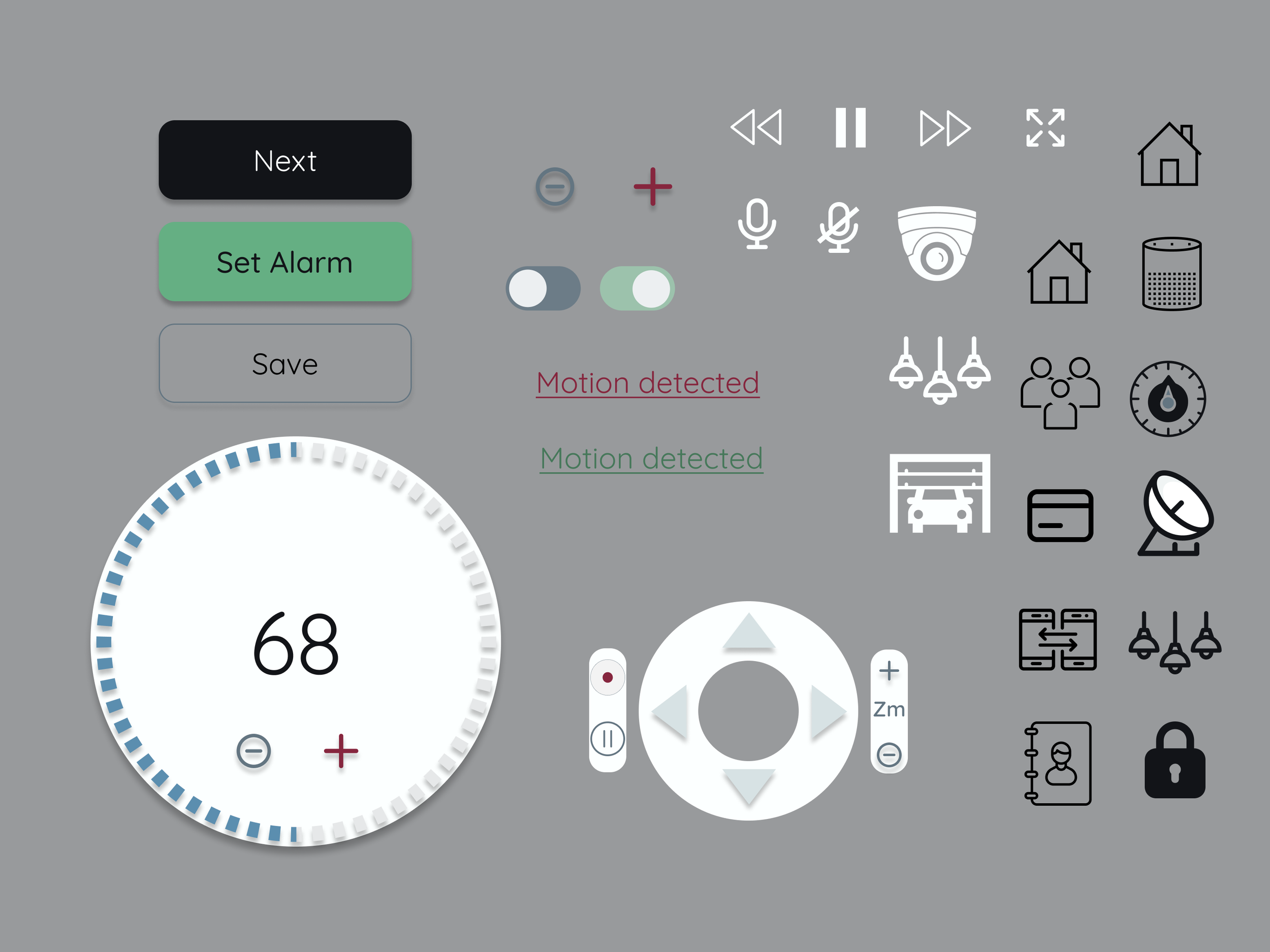

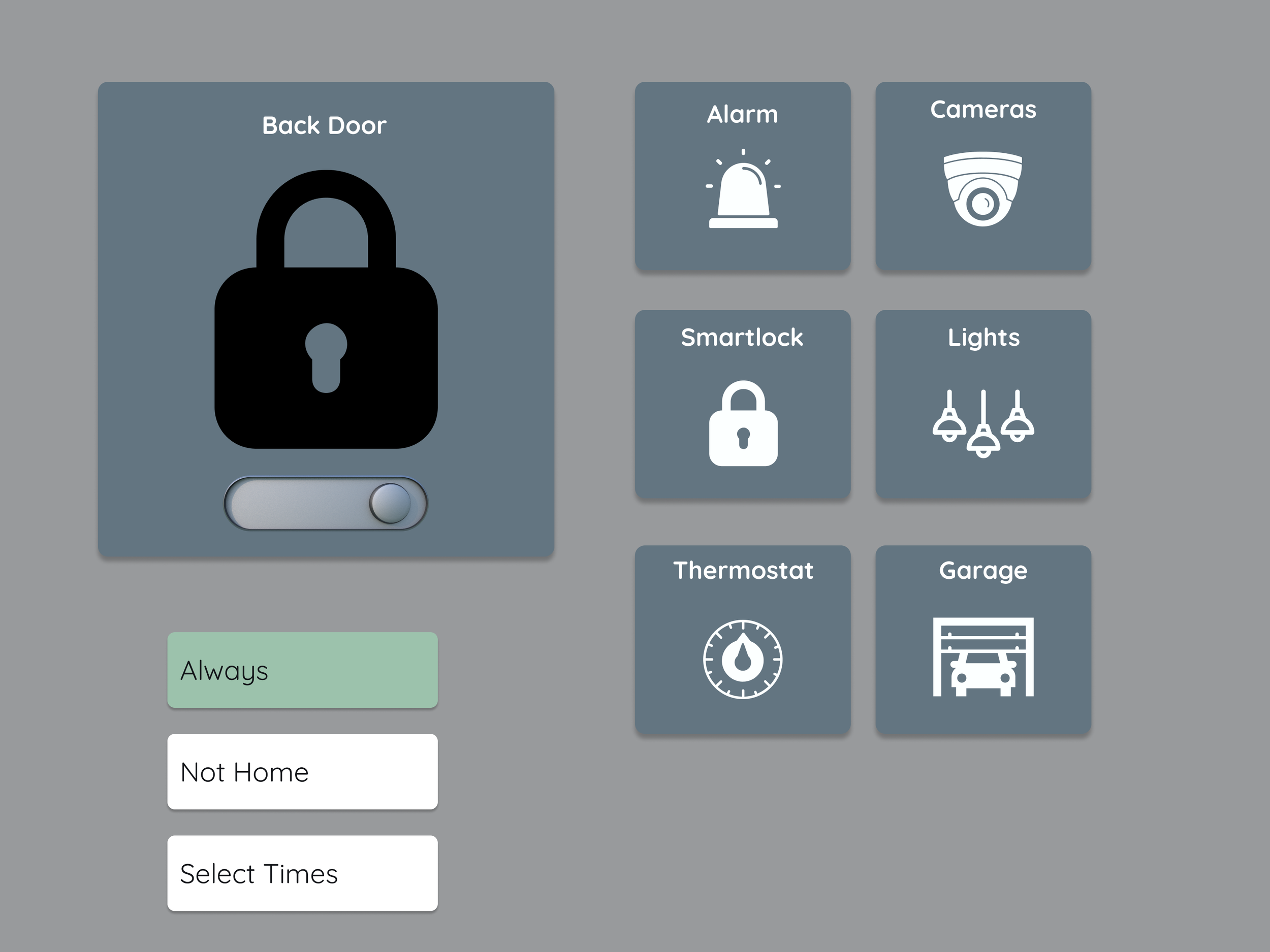
High-fidelity


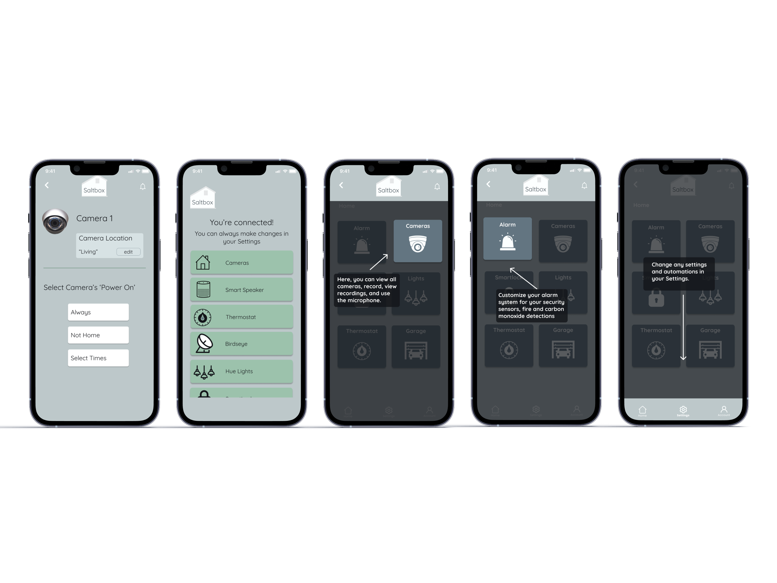


User tests included a Prototype Task Analysis. Users were asked to got to the Home page, navigate to the Alarm, set themselves for ‘not home’, then navigate to the thermostat and adjust the temperature. One hundred percent of users completed the task. Heat maps reveal clicks and misclicks, demonstrating how easily users found the features. Responses include “everything was where I expected it”, “the design is very clear”, “it was easy to find and easy to set”. Users requested the ability to set the temperature by touching the dial. This UI is planned, but just not yet prototyped. Users should be able to adjust the temp by either clicking the +, -, or by touching the dial.
Prototype
Here is a screen recording of the Saltbox protoype.