
Pop Fitness
A responsive web app to help people get into exercise by providing routines, guides, and interactive examples. Exercise that can fit into any schedule, no matter how busy.

Problem
Starting an exercise program can be intimidating and difficult, especially for beginners or for people hoping to try something new. Exercise can also be challenging for busy individuals.
Solution
Pop Fitness offers guides, interactive examples, and information to make it accessible and welcoming for all.
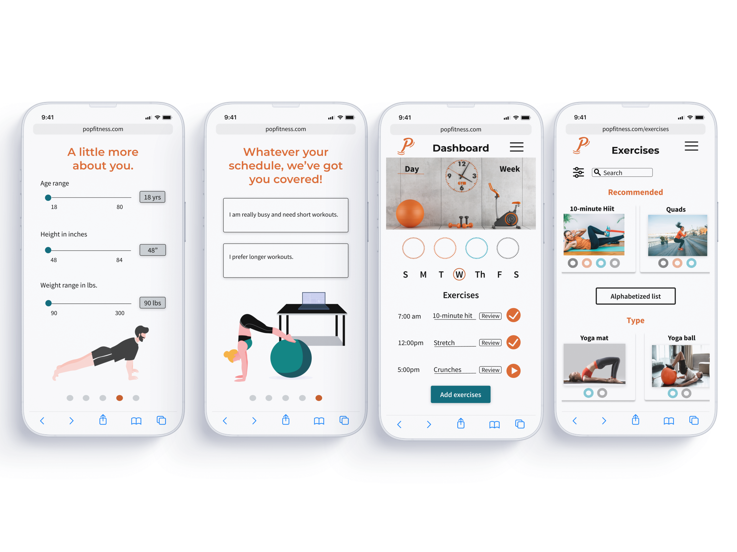
Exercise routines can be worked into the busiest schedules, even if this means a 5-minute routine.
Objective
The project began with the intent to create a responsive web app that could motivate people into an exercise routine that suits their level, schedule, and interests.
My role & time
UX/UI Designer
3 months

Tools used
User Persona

After engaging in user interviews, I discovered strong themes regarding goals, frustrations, behaviors, and needs. Users often want to lose weight and get in shape, and their sedentary jobs don’t allow a lot of time for exercising.
Who
Pop Fitness is for people who are new or returning to fitness, want to find activities they like, and get into a good routine that will fit into their busy schedules.
How
How will users engage with Pop Fitness.?
Considering the tasks, I created user flows early in the process.
Wire frames
Early wire frames focused on onboarding, searching exercises, accessing informational videos, setting daily challenges, and starting an exercise.


Information Architecture

Testing the Information Architecture with a Card Sort. I tested all major features. Users grouped together all features related to exercise. However, surprisingly, they did not group together daily, weekly, monthly progress. Further testing would be done later with mid-fidelity.
Mid-fidelity
I next created mid-fidelity frames to add more detail and allow for a better sense of how users would flow through the app and complete the tasks.


Designing with mood boards
I focused on the vibrant colors of orange and teal, as these colors symbolize energy and motivation, and I aimed to create a dynamic, engaging feel with the app. I directed the project towards motivation and energy. Fitness consistency and follow-through can be challenging for users. Motivation is crucial. A vibrant, engaging design, with enticing elements, might help to encourage users to continue with their exercise goals.


A/B Testing

Preference test for high-fidelity screens. Users were nearly evenly divided with a 60/40 split. However, the clean and minimalist screen proved to be the most preferable for users. Furthermore, considering accessibility, the log in and sign up buttons were easier to find and read.
H-fidelity
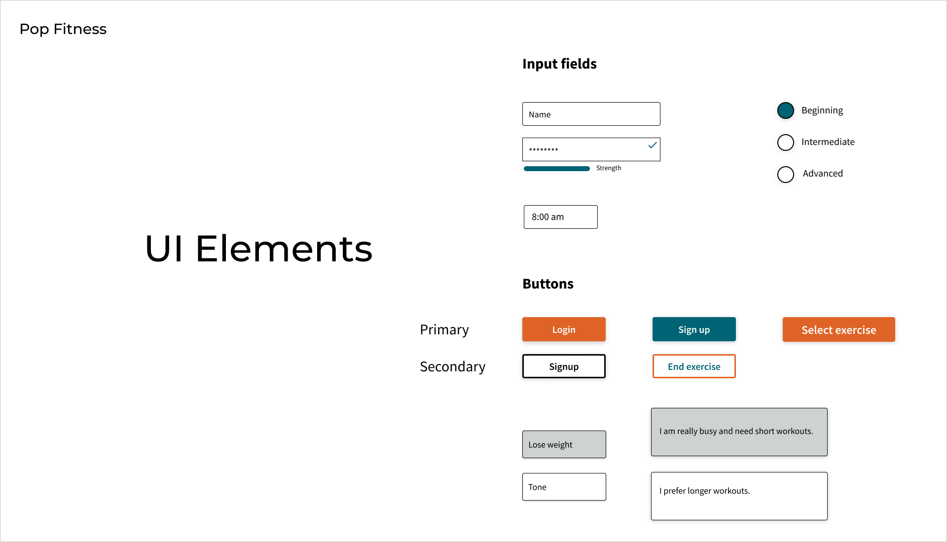
high-fidelity frames with color, UI elements, illustrations, photos, and animations. Illustrations are used for onboarding, while photos are used for exercises. HIgh-fidelity frames include plenty of white space with pops of orange, black, and teal, maintaining the vibrancy and energetic concept first generated in the mood boards.


Various Breakpoints
Pop Fitness on mobile, tablet, desktop.

Pop Fitness in Context
You can use Pop Fitness at the gym, on the go, outside, at home
Pop Fitness Prototype
Next steps
Moving forward, Pop Fitness can include additional features, such as more developed “Progress”, with clearer rewards, and better built-out record of previous workouts and successes. People like to see their success as a way to stay motivated, and although Pop Fitness currently includes this feature it can be further developed.
Sharing and competing with friends is another great motivator. Currently, Pop Fitness includes these features, but they could use some additional design and testing.
Contact me.
heathercooper500@gmail.com
(408-207-8983)